OWL.Bike Coffee :: Package Design

The Project

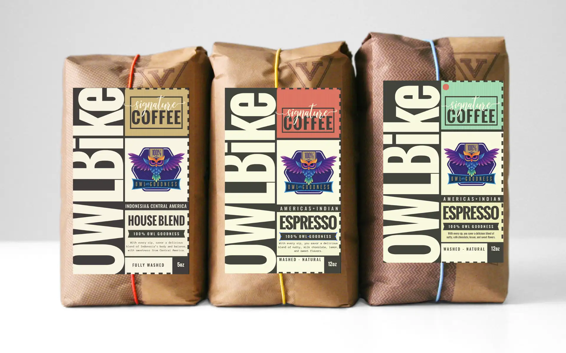
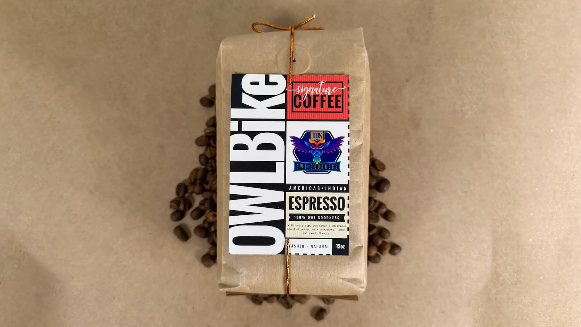
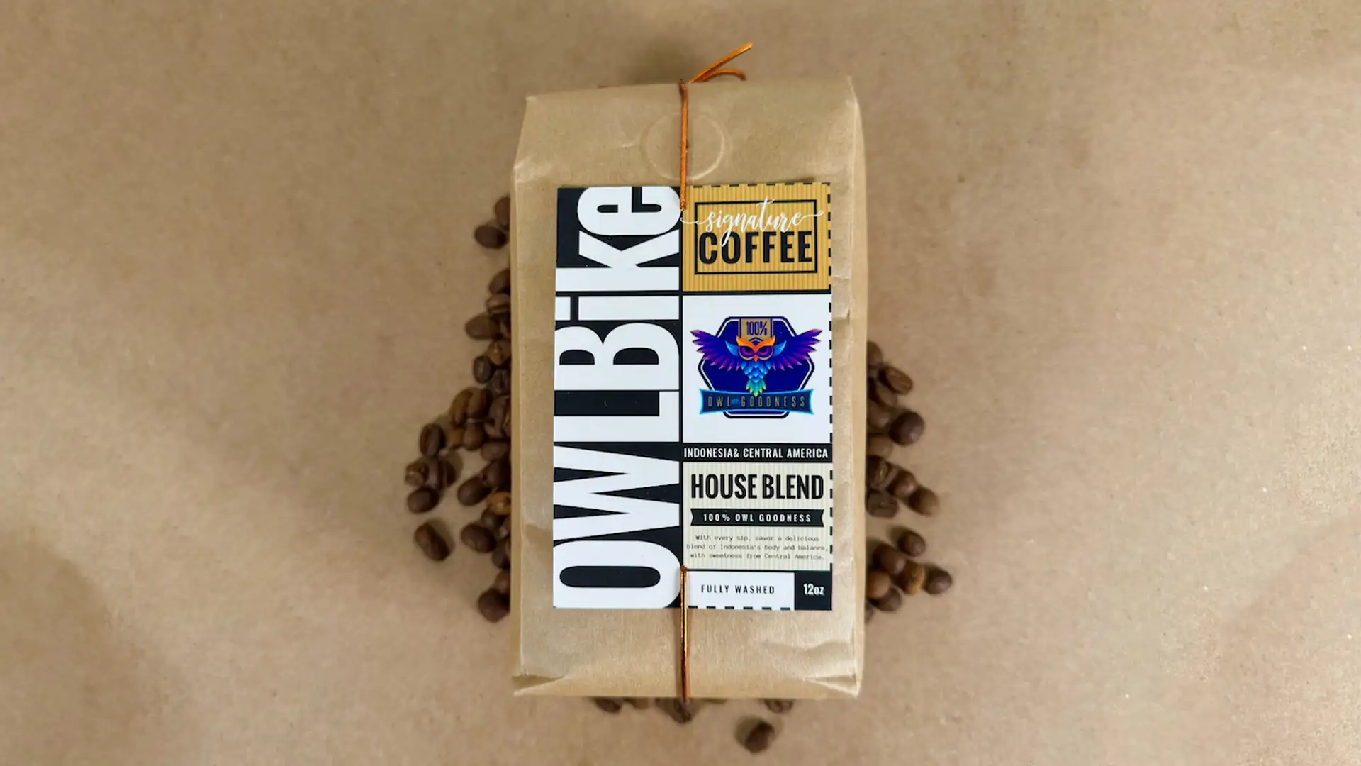
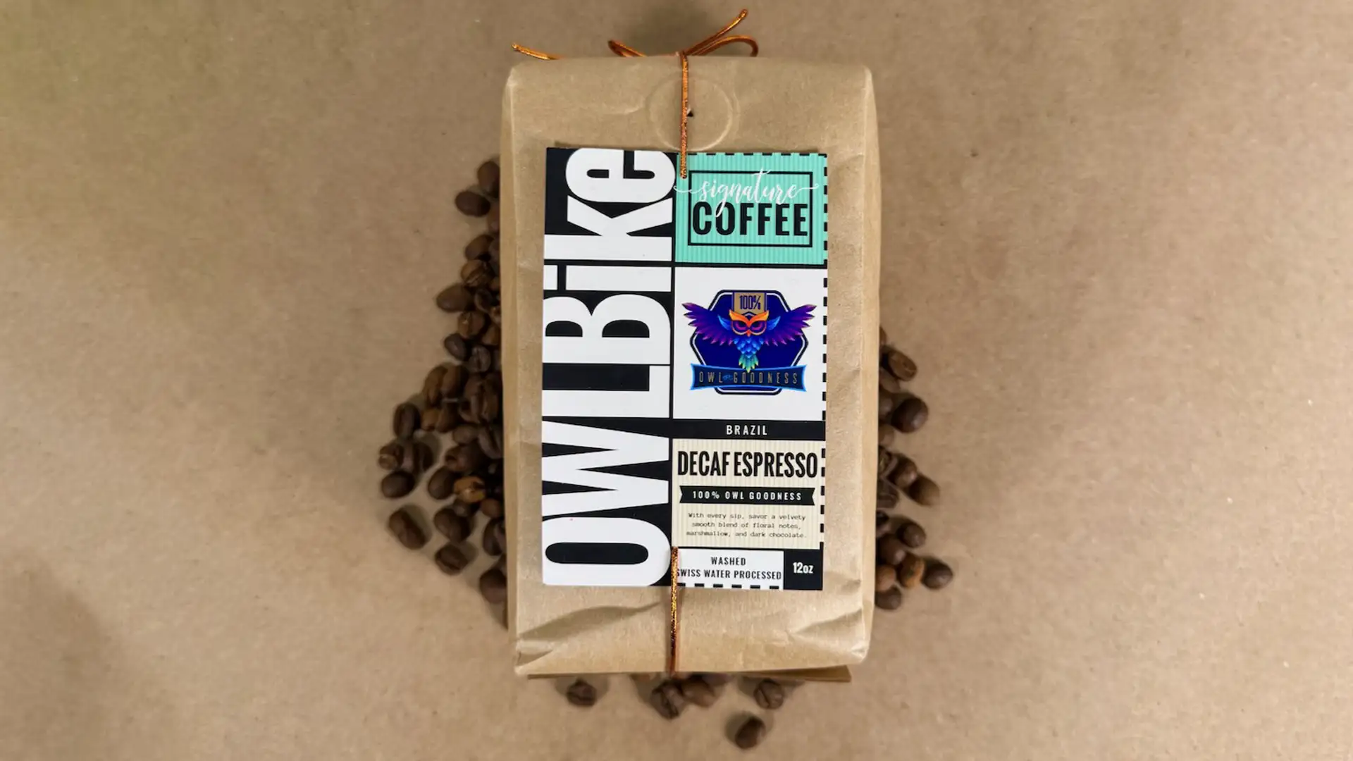
Within the specialty coffee domain, design plays a crucial role in distinguishing coffee from the commonplace. Packaging and label design serve as key elements, acting as gatekeepers of distinction that capture the interest of discerning coffee enthusiasts.

Coffee is synonymous with cycling. It’s an integral part of the journey. The jolt of energy from a pre-ride espresso, or the shared social experience after a long weekend ride – coffee elevates cycling. Our branding mission? To craft a brand for OWL.BiKe that reverberates with the essence of this unique culture, intertwining the spirit of cycling with the aroma of coffee.

Client

OWL.BiKe

Project

BrandingPackage Design

Our Role

Design

What We Did

As part of our branding endeavor for OWL.BiKe, we undertook the challenge of crafting a distinctive package design for their coffee line. The 100% OWL Goodness coffee packaging prioritizes sustainability and eco-conscious materials, integrating thoughtful design features such as resealable bags and recyclable packaging.

Infusing a blend of retro and modern design sensibilities, the packaging evokes nostalgia with its brown paper bag aesthetic while infusing contemporary elements. The label boasts bold and vibrant hues, captivating typography, and minimalist yet visually striking graphics, all secured to the package with a copper metallic string tie.

Detailed information about the coffee’s origin, flavor profile, and brewing suggestions are distinctive design elements on the packaging label, enabling consumers to fully embrace the unique qualities of each coffee blend. The trio of roasts—Espresso, House Blend, and Decaf Espresso—sport distinctive color blocks for effortless identification on store shelves.